
Design Notes | A Designer’s Guide to the Best Warm White Paint
- 2 days ago
- 3 min read
Choosing a white paint color sounds simple in theory, but anyone who has stood in front of a wall of paint swatches knows otherwise.
Some whites feel warm and layered, while others feel crisp and modern. A few can completely change throughout the day, shifting with the natural light in ways you never expected. The difference may seem subtle at first, but it has the power to shape the entire atmosphere of a home.
There’s something about the right white paint that makes a space feel instantly settled — soft, timeless, and lived in rather than stark or overly polished.
Today, we’re sharing a few of the white paints we return to most often, along with the small details we always consider before choosing one.

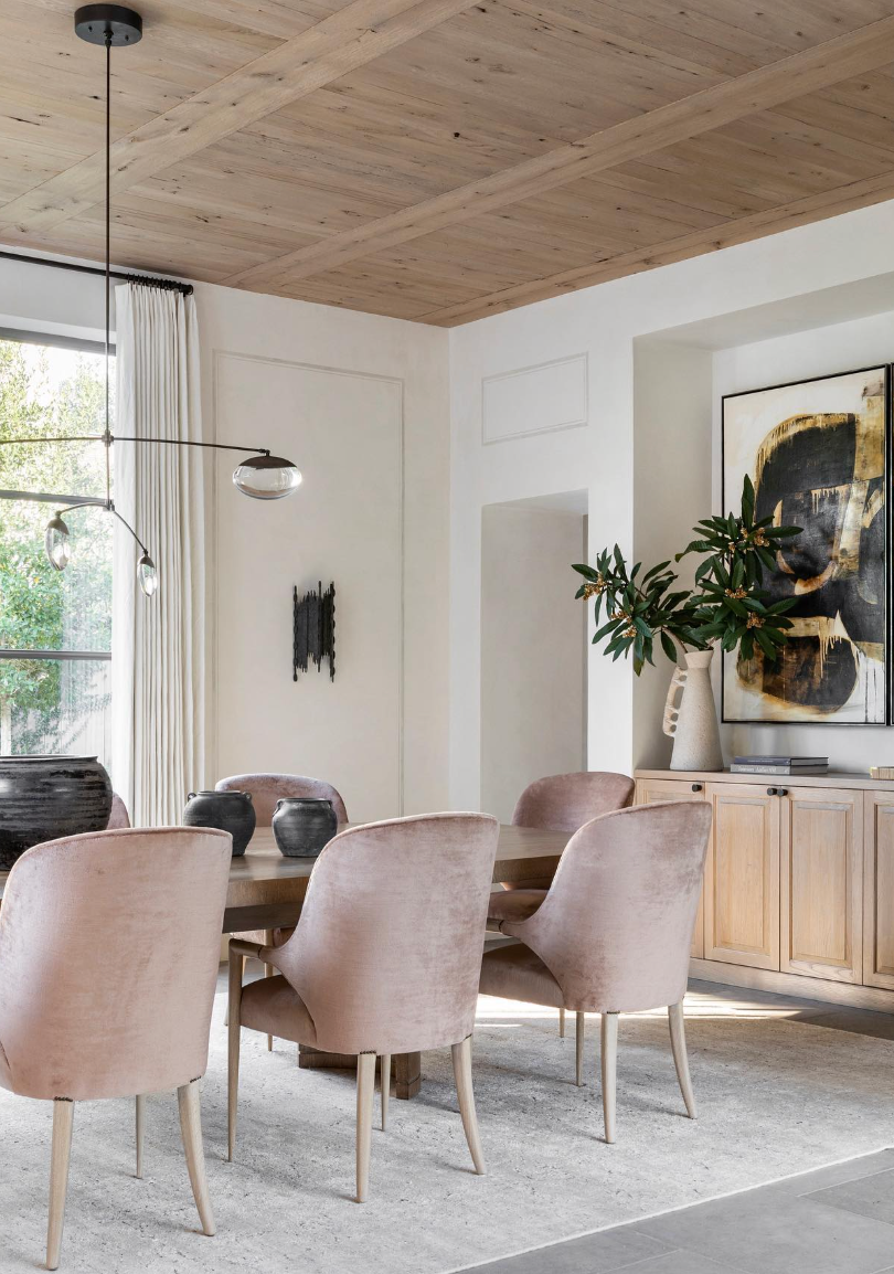
Design: Jede Interiors
Warm Whites vs. Crisp Whites
Before choosing a white paint, we always start by thinking about the overall feeling we want the space to have.
Warmer whites tend to feel softer, more layered, and more relaxed, while crisper whites create cleaner contrast and a brighter finish. Neither is necessarily better — it simply depends on the natural light, surrounding materials, and overall mood of the home.
Homes with warmer wood tones, natural textures, and softer lighting often pair beautifully with warmer whites, while brighter whites tend to work well in modern spaces or homes with stronger architectural contrast.
Our Favorite Whites
1 | White Dove by Benjamin Moore Soft warm white with subtle grey undertones
White Dove is one of those colors we return to again and again. It feels soft and timeless without leaning overly creamy, making it incredibly versatile.

Design: Sarah Birnie Interiors Paint Color: White Dove
We especially love using it in living rooms, kitchens, and open-concept spaces where you want the home to feel warm, layered, and inviting.
Best for:
Layered neutral interiors
Warmer wood tones
Soft natural light
Exteriors
2 | Swiss Coffee by Benjamin Moore
Warm white with creamy undertones
Swiss Coffee has a slightly creamier undertone that creates a more relaxed and lived-in feel. We especially love using it at 75% strength, which softens the color just enough to keep it from feeling overly creamy while still maintaining its warmth.

Design: Studio McGee Paint Color: Swiss Coffee at 75%
Paired with natural textures like linen, plaster, warm wood tones, and aged brass, it creates a layered and inviting atmosphere without feeling too yellow or heavy.
Best for:
Softer, tonal interiors
Spaces with abundant natural light
Homes with natural materials
Relaxed, layered living spaces
3 | Alabaster by Sherwin Williams Warm white with subtle beige undertones
Alabaster is a warm white that feels soft and approachable without losing brightness. IIt has a timeless quality that works beautifully across a variety of interiors, creating a backdrop that feels calm, inviting, and effortlessly layered.

Design: The LifestyledCo Paint Color: Alabaster
We love how versatile it feels throughout the day, adapting beautifully to changing natural light without ever feeling too stark or overly creamy.
Best for:
Homes with layered neutrals and natural textures
Bedrooms
Living spaces
Walls and trim
4 | Greek Villa by Sherwin Williams Warm white with soft creamy undertones
Greek Villa has a softness that feels clean and fresh without appearing stark. It’s one of those whites that works beautifully across a variety of interiors because it balances warmth and brightness so effortlessly.
Design: Marie Flanigan Interiors Paint Color: Greek Villa
We especially love it for walls, trim, and kitchens where you want a light and airy feel that still feels welcoming.
Best for:
Kitchens
Walls and trim
Bright interiors
Homes with mixed natural textures
Need Help Choosing the Right Paint Colors?
If you’re looking for personalized guidance for your home, our 1:1 virtual design consultation is designed to help you confidently move forward — whether you need help selecting paint colors, refining finishes, or creating a more cohesive feel throughout your space.
A Few Things We Always Consider Before Choosing White Paint
Natural light changes everything
Flooring can dramatically affect undertones
White paint shifts throughout the day
The brightest white isn’t always the best choice
Always test samples on multiple walls and spaces before committing
Final Thoughts
The best white paint colors are the ones that quietly support the feeling of a home rather than compete with it.
A well-chosen warm white has a way of making a space feel softer, more layered, and instantly inviting — creating the kind of atmosphere that feels timeless long after trends have passed.

Comments